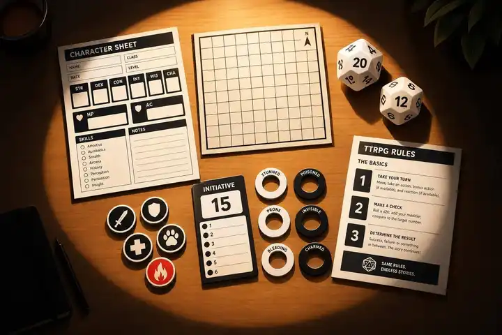
I start with dark text on a light background, clear labels, and a check from every player’s seat. For shared aids read from 3–5 feet away, I use 24-point text or larger as a starting point, then test under the table’s lighting.
These seven aids help keep game information easy to find:
- Bold character sheets: Keep stats and writable fields easy to read.
- Dark-light token sets: Identify creatures with contrasting markings, shapes, and IDs.
- Large-print battle maps: Make movement, cover, and terrain clear.
- High-contrast condition cards: Show effects, duration, and when they end.
- Color-safe handouts: Pair colors with labels, symbols, or patterns.
- High-contrast initiative trackers: Keep the current turn and next actor visible.
- Bold rule references and player aids: Put common actions, costs, effects, and safety tools within reach.
My rule: color is a backup cue, not the only cue. Before printing a full set, I check a grayscale sample, glare, text size, and room for updates. <u>Start with the aid your players struggle to read most.</u>

7 High-Contrast TTRPG Aids for Easier Table Play
Beyond Dark Mode: Comprehensive Color Contrast Strategies for Accessibility | Accessible Web Webinar
Contrast, Text Size, and Table Lighting
Before choosing from the best TTRPG games or an aid, check contrast, text size, and lighting. Treat WCAG contrast ratios as the minimum: 4.5:1 for normal text and 3:1 for large text. Large text means at least 18-point regular or 14-point bold. Printed aids still need testing at the table.
For the aids that follow, use 24-point text or larger when players read them from 3 to 5 feet away. Choose a clean sans-serif font, bold key labels, and leave whitespace between information groups. Clear headings help players find key information fast, but test the layout at the table.
Good layout can't make up for poor lighting. Check a printed sample under the lighting you'll use during the session. Glare and shadows can wash out text.
Test each aid from every seat, including side-angle views of shared maps and trackers. Ask players whether larger labels, more space between items, or better placement would help them scan information faster.
1. Bold Character Sheets
Text and Graphic Contrast
Use bold labels and thick dividers to separate defenses, hit points, abilities, conditions, resources, and action options. Skip textured backgrounds, low-opacity text, and gray-on-gray combinations. Group related details into clear blocks, with bold labels and body text that’s easy to scan.
Readable at the Table
Players need room to make quick updates during play. Print the sheet at its actual size and test it with a pencil. Leave enough space to erase damage, adjust totals, and add temporary modifiers without writing over labels. Offer an 18-point large-print version, even if it takes a second page.
Identification Without Color
Label conditions and action types directly rather than relying on color. Give resources labeled checkboxes or tally fields. Every rule distinction should remain clear when the sheet is printed in grayscale.
Finding Information Faster
Place defenses, current hit points, and maximum hit points near the top. Separate conditions from permanent abilities, and put resource trackers beside the abilities that use them. Keep action entries short, with the action type in each heading.
Test the sheet by finding a defense, marking damage, and recording a condition.
2. Dark-Light Token Sets
Text and Graphic Contrast
Tokens need the same attention to contrast as sheets. But shape and labels matter just as much as color.
Use light tokens with dark markings and dark tokens with light markings. Add contrasting rims so both stand out against the map. Use WCAG’s 3:1 contrast target as a baseline for tokens against the map.
Reading from Your Seat
Choose large, bold symbols and matte finishes to limit glare. Then check the tokens from every seat. If someone has to lean forward to read one, enlarge the markings or shorten the label. Add side markings when taller tokens are hard to read at an angle.
Tokens should be easy to read at a glance, especially beside maps, trackers, and condition markers.
Identification Without Color
Give tokens different shapes or border styles rather than relying on opposite tones alone. Use the shape or base style to show faction, and a letter or number to identify each individual.
Reserve outlined markers for objectives, striped or crosshatched markers for hazards, and smaller labeled overlays for status effects. Keep overlays clear of the token ID.
Finding Information Faster
Match token IDs across the table so players can follow the same creature on the map and in the initiative order. Give every token its own ID, repeat it on character notes and condition markers, and say the full ID when announcing turns.
Keep a small legend beside the tracker. For duplicate creatures, use numbered rings or removable labels to tell them apart.
3. Large-Print Battle Maps
Battle maps work only when players can read the space at a glance. They need to count movement, spot cover, and understand terrain without slowing down play.
Text and Graphic Contrast
Use thick, dark grid lines on a light background, with walls and key boundaries drawn heavier than the grid. Make doors, cover, hazards, and elevation changes larger. Remove decorative shadows or textures that make playable spaces hard to see.
Reading from Your Seat
Print on sheets at least US Letter (8.5 × 11 inches), using 1-inch squares by default. Larger squares can be easier to see, but require more table space or tiled pages. Print at 100% scale - not “fit to page” - and use a ruler to check the square size. Add bold, 18-point zone labels, then check the map from the farthest seat.
Once the grid is clear, check whether players can understand the terrain without color.
Identification Without Color
Pair color coding with different patterns and direct labels. If the map uses several symbols, add a small legend. Leave enough white space around each symbol to keep it from blending into nearby details. Print a grayscale draft first to check readability.
Finding Information Faster
Add coordinate letters and numbers along the edges, label important zones, and keep the distance per square consistent. This helps players move, target, and choose cover quickly. Make barriers, cover, and difficult terrain easy to spot.
Before play, ask a seated player to count squares along a path, locate cover, and identify terrain without help. Revise anything that slows them down.
4. High-Contrast Condition Cards
Text and Graphic Contrast
Like tokens and maps, condition cards should be readable at a glance. Use the same layout for conditions, spells, hazards, and recurring rules: a prominent title, a bold icon players can recognize, a one-line effect summary, duration, and an ending condition.
Place the key effect directly below the title. Choose plain fonts and bold field labels. Follow the earlier contrast standard: 4.5:1 for text and 3:1 for icons.
Reading from Your Seat
Choose matte card stock or sleeves to reduce glare. Set each card beside the affected player’s sheet or in a stand facing that player. If someone has to pick up a card to read it, increase the type size or move it closer.
Identification Without Color
Treat color as a backup cue, not the only way to tell cards apart. Give each category a written label and a distinct icon or border pattern. That way, players can identify conditions even when colors look alike. Keep icons simple enough to recognize at card size.
Finding Information Faster
Build cards for your group’s most common conditions first, then add recurring spells and hazards. Copy mechanics exactly, including timing triggers and exceptions. Use separate Duration and Ends fields, and include any relevant timing notes.
Keep one card visible for each active effect, with a small tracker for rounds or saves. Players can then check what matters without stopping play.
Apply the same visual hierarchy to handouts and quick-reference sheets.
5. Color-Safe Handouts
Text and Graphic Contrast
Use dark text on white or very light paper for clues, faction sheets, item cards, maps, and summaries. Keep text off artwork and textures, and save decorative color for secondary emphasis. Give key map boundaries, symbols, boxes, labels, and icons at least 3:1 contrast against nearby colors so players can find information faster.
Reading from Your Seat
Print a draft on US Letter paper and read it from a player’s seat under your session lighting. Use bold headings, short paragraphs, and generous spacing. Left-align body text and place the most important information near the top.
Identification Without Color
Give every color-coded category a written label and a distinct border, symbol, or pattern. On maps and faction sheets, label locations and groups directly, and pair patterns with text.
Print a grayscale copy before play; different colors can print as the same gray. Check that categories, boundaries, and symbols remain distinct. If two areas blend together, add a label, border, pattern, or icon - not another color. Check photocopies, too, since fine lines may disappear. Once colors and patterns remain readable, arrange the content for fast lookup.
Finding Information Faster
Use a fixed order: title, category, purpose, key facts, next action. This helps players find the right line and get back to play faster.
Number clue points, keep faction names and stances at the top, box item actions and limitations, and place map symbols in a labeled legend. Ask one player to use the handout without help, then fix any unclear labels.
The same label-first structure also makes initiative trackers faster to scan.
6. High-Contrast Initiative Trackers
Turn order needs the same high-contrast treatment as sheets and handouts, but it has to update faster.
Text and Graphic Contrast
Use bold names and initiative numbers in 18-point type or larger. Keep text contrast at 4.5:1. Choose vertical strips, numbered cards, magnetic markers, or dry-erase trackers based on how often initiative changes. Before play starts, test the tracker from every seat.
Reading from Your Seat
Put the tracker where everyone can see it without standing or leaning across the table. Under session lighting, check the view from the farthest seat and from seats at an angle. Ask players to read the active turn, the next number, and one status from where they’re sitting.
Check for glare from lights, windows, lamination, or sleeves. If labels wash out, angle the tracker away from the lights and use matte materials. On dry-erase surfaces, use broad-tip markers to make solid lines, and erase any ghosting.
Identification Without Color
Use direct labels and fixed cues for ACTIVE, WAITING, DELAYED, and DEFEATED so players can read the tracker in grayscale.
Finding Information Faster
Keep every entry in the same order: initiative number, name, status symbol. Track rounds on a separate counter, and move the active-turn arrow after each turn.
Keep an eraser, spare marker, or replacement cards within reach so turn order checks and updates don’t hold up play. Run one combat test to spot crowded labels and slow updates.
7. Bold Rule References and Player Aids
Rule references need the same bold, high-contrast style as sheets, maps, and trackers - but players need to scan them even faster.
Text and Graphic Contrast
Use bold headings, short bullets, and separate blocks for movement, dice results, and safety tools. Stick to plain backgrounds and solid borders. Make actions, costs, and effects easy to spot, and put unusual cases in an outlined Exception box.
Reading from Your Seat
Create a one-page US Letter quick-reference sheet and a separate large-print version with 18-point text. Give each player a copy within comfortable reading distance. Move longer explanations to a second page.
Identification Without Color
Label movement diagrams with distances in feet, directional arrows, and distinct boundary patterns. Use fixed columns for result range and mechanical effect in dice-result charts, with borders between rows.
Put safety tools in a prominent, clearly labeled block that states the player’s action and the facilitator’s response. At session zero, tell players they can use these tools without explanation.
Finding Information Faster
Give each common action the same three-part layout: What You Do, What It Costs, and What Happens Next. Include the check, cost, and effect - not the full rulebook text.
Label sections Core Rules, House Rules, and This Session. Date temporary rules and remove them when they no longer apply.
Ask someone who didn’t design the sheet to find a movement limit, interpret a dice result, and locate a safety procedure. Rewrite any heading or instruction they need you to explain.
After testing with a new reader, use the checklist below to check that every aid is easy to scan at the table.
Visual Aid Uses and Setup Trade-Offs
Choose aids based on what players need to read fastest and how much upkeep each aid adds.
| Aid | Primary use | Fastest-access information | Main preparation trade-off |
|---|---|---|---|
| Bold character sheets | Track character statistics and resources | Hit points, defenses, saves, remaining abilities | Redesigning and testing take time as character options change. |
| Dark-light token sets | Identify creatures and factions | Token ID, ownership, faction | Labels and symbols need updates as encounters change. |
| Large-print battle maps | Count movement and locate terrain | Boundaries, obstacles, objectives, grid spaces | Larger maps take up table space; tiled prints add seams and assembly. |
| High-contrast condition cards | Track active effects | Condition, effect, duration, removal | Cards need printing, sorting, and replacement when rules change. |
| Color-safe handouts | Identify clues, groups, and locations without color | Faction, hazard, destination, priority | Grayscale testing takes time; extra patterns can crowd pages. |
| High-contrast initiative trackers | Track turns and rounds | Current actor, next turn, round number | Clear sightlines may require a higher position or a duplicate display. |
| Bold rule references and player aids | Look up common procedures | Procedure, action cost, modifier, threshold | Summaries need accuracy checks and references for exceptions. |
These trade-offs show where each aid takes the most time, space, or upkeep. A one-time redesign takes work up front, while tokens and cards need updates as encounters change.
Check table space before printing maps. Players need room to see terrain and count movement without crowding. US Letter tiles work with smaller printers, but they add seams and assembly. Include alignment marks and overlap margins, and join the tiles with removable tape.
Test one sample under session lighting before printing the full set or laminating. Check shared displays from the farthest seat, then fix unreadable labels and blocked sightlines first. Wait until the wording and layout are final before laminating.
Use the checklist below to check readability before printing the full set.
Table-Readiness Checklist
Use this checklist before printing, laminating, or bringing aids to the table.
Check contrast in grayscale. Give every color cue a matching label, symbol, shape, or line style.
Read the smallest text from the farthest seat. Players shouldn’t have to lean forward or ask someone else to read key information.
Test writable fields with the pencil or marker you’ll use. Leave enough room to update and erase entries. Make sure tokens and clips can move without hiding nearby map details.
Keep recurring information in the same places. Ask players privately about their preferred type size, spacing, brightness, and colors. Offer adjustable versions when practical.
Before play, test one aid from each seat.
FAQs
How can I improve readability on a tight budget?
Stick with high-contrast designs and materials you already have. Print handouts on standard 8.5 × 11-inch paper, draw shared maps on large paper with bold markers, and make quick-reference sheets for frequently used rules so players spend less time flipping pages.
For digital materials, leave plenty of white space, choose sans-serif fonts, and aim for 50–75 characters per line. Keep layouts clear and consistent, using simple icons or color-coding to help readers find what they need.
How do I balance different players’ visual needs?
Use high-contrast visuals, dyslexia-friendly fonts, and adjustable text sizes to help players read comfortably. Clear headers and white space keep information organized and pages from feeling crowded.
Provide both physical and digital formats so players can choose what works for them. For hybrid or digital sessions, choose tools with screen reader support, alternative text for images, and digital combat tracking to make gameplay accessible and easy to follow.
Can I adapt these aids for online play?
Yes. Virtual tabletops (VTTs) support shared maps, dynamic lighting, automated character sheets and dice, and clear, color-coded digital tokens.
For easier reading, use high-contrast PDFs or large-print documents that work with screen readers. For handouts and rule visuals, choose accessible, searchable text or interactive PDFs. Make sure the text scales so players can zoom in without disrupting the layout.


